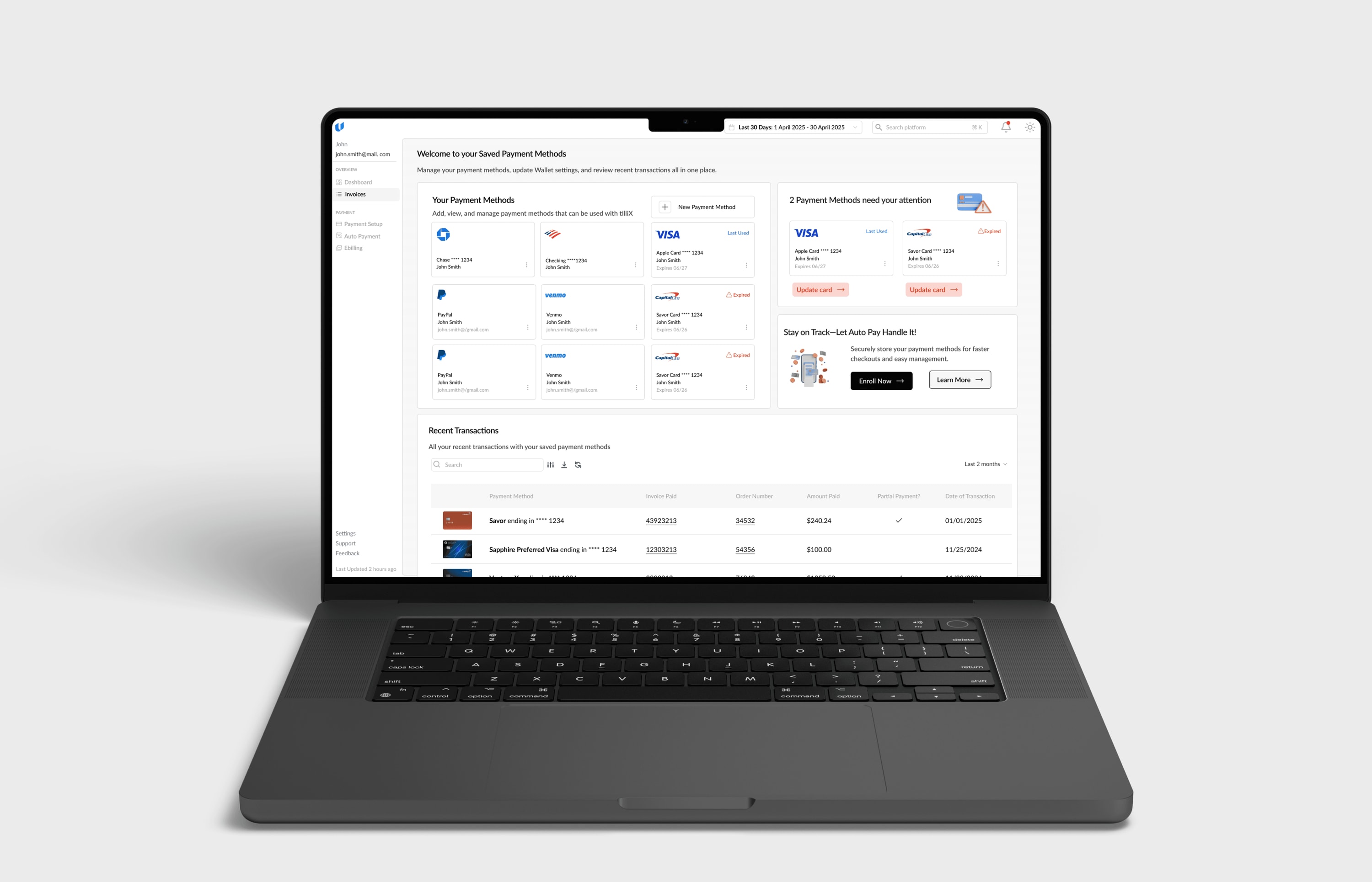
Building tilli's design system from the ground up
During my time at the fintech start-up, I discovered mid-project that the company had no shared visual language.
So I built one… from scratch, alongside a 0→1 product build, with no prior foundation to work from.
- role
- Sole Product Designer
- industry
- B2B, Fintech, SaaS
Context
Laying the groundwork to scale.
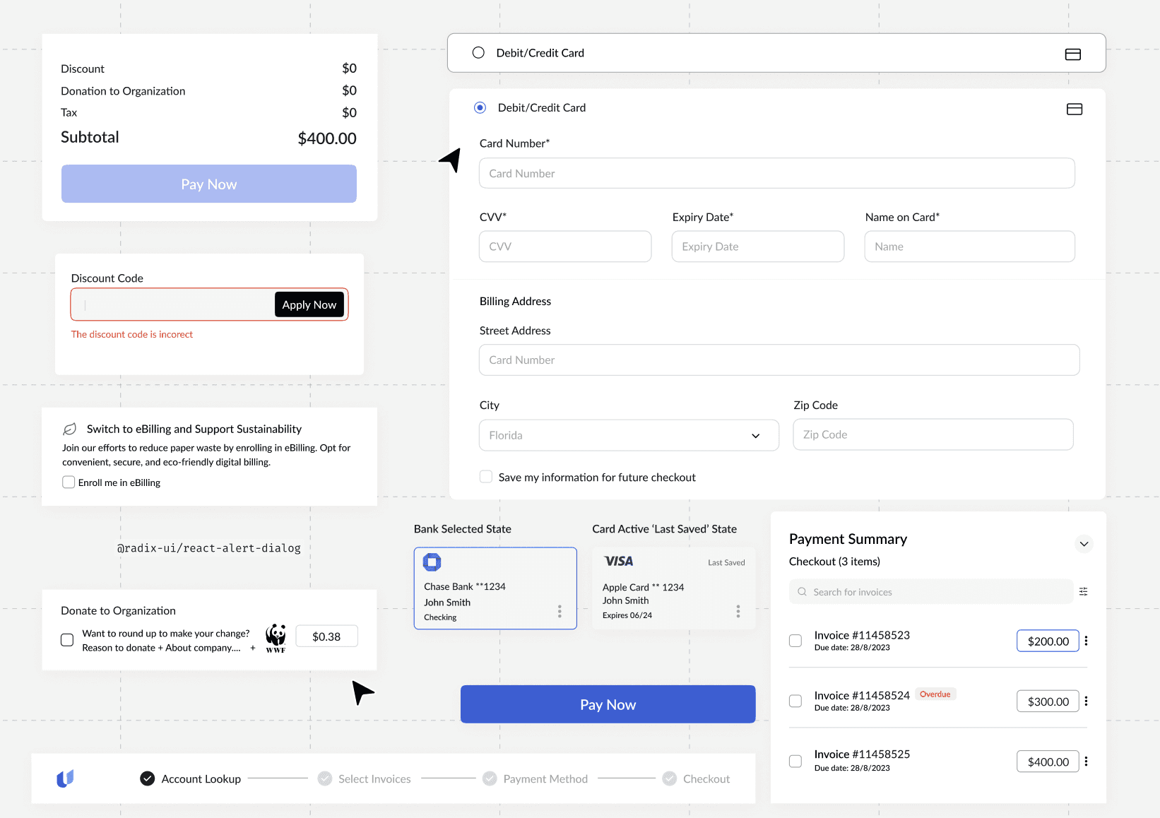
When I joined tilliX, tilli was already operating as a growing product with multiple live workflows, but there was no design system to support that scale.
Inconsistent components, no shared tokens, no docs. Engineers were filling design gaps themselves just to keep moving.
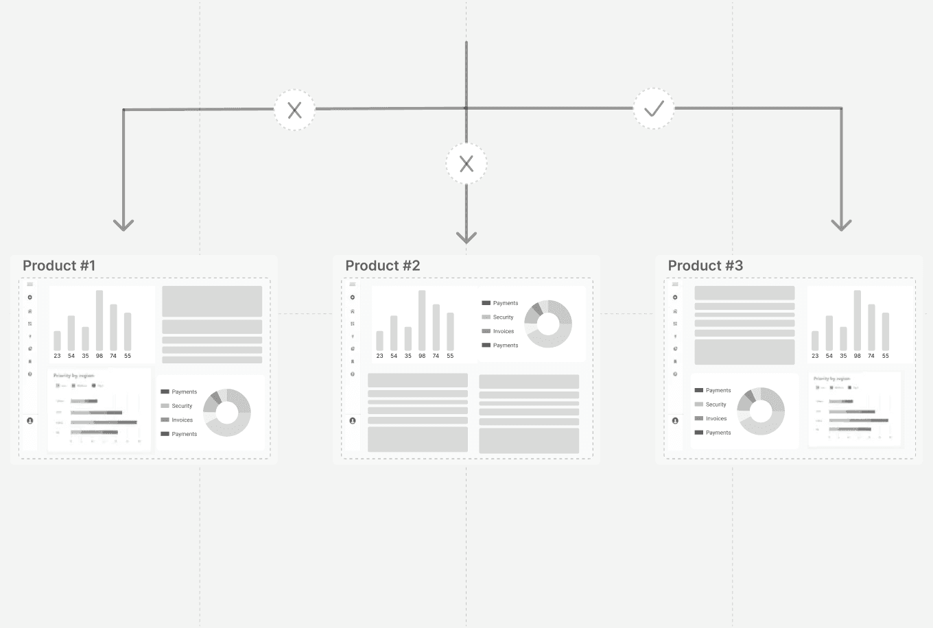
“I couldn't build a zero-to-one product cleanly on top of inconsistency. And neither could anyone who came after me.”
Engineer interviews and component documentation
Understanding how teams use component docs.

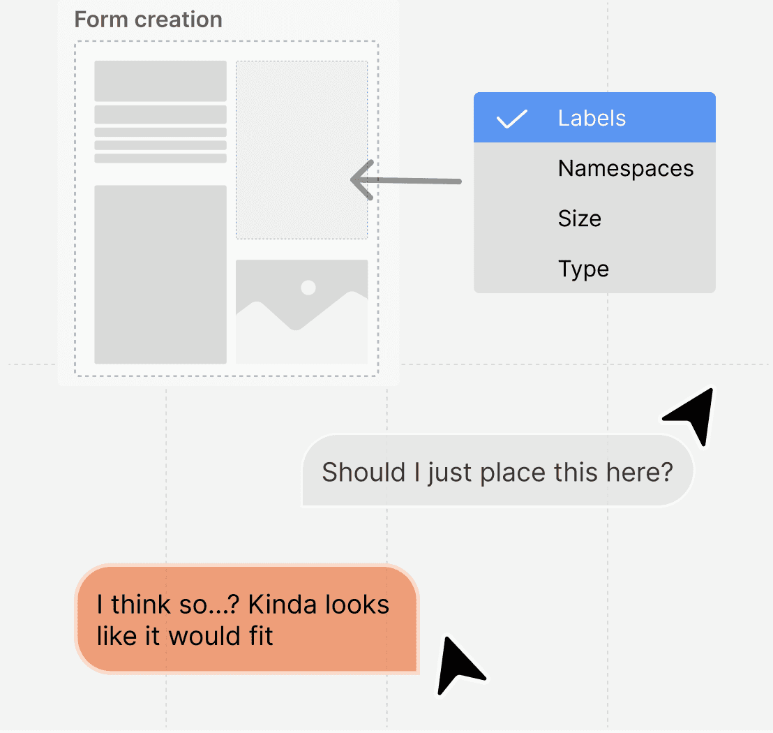
Since they were the ones actually building these components, I sat down with engineers to understand what was actually painful in their day-to-day.
Design priorities
I made sure to align the design features with our product team needs, creating goals to ensure my solution addressed the prior pain points successfully.
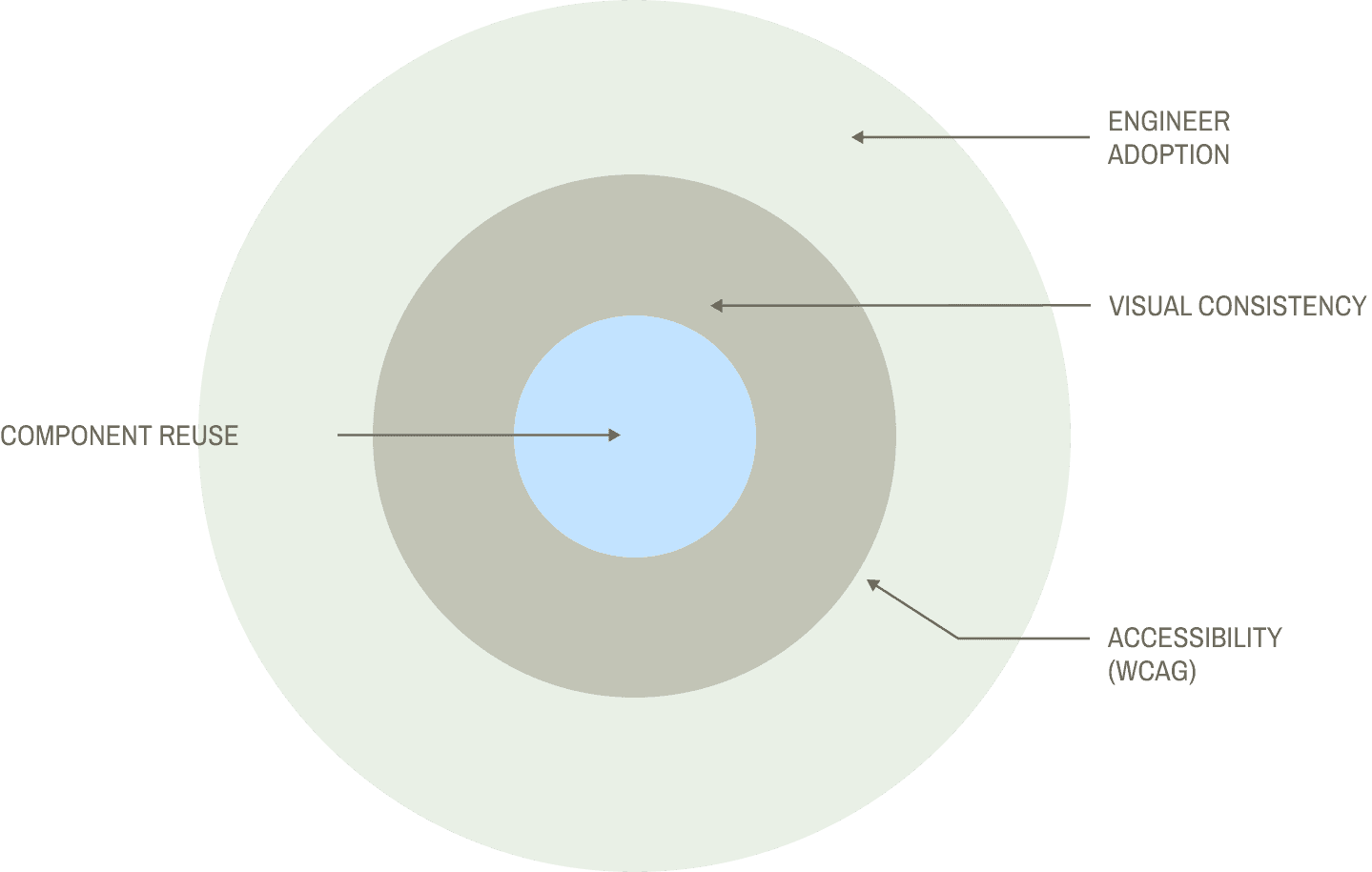
visual inconsistency
Shared components establish consistent patterns across product workflows.
no source of truth
A shared component library and documentation give design and engineering a common reference.
compounding debt
Every new product made it worse.
offshore risk
No shared standards meant misalignment would happen fast.
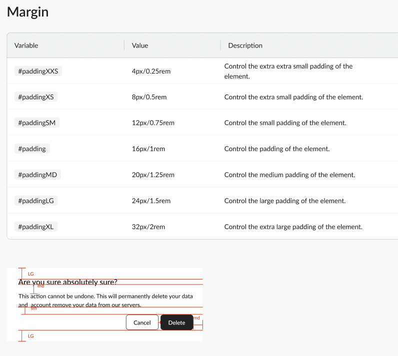
Design tokens and component architecture
As tilli expanded its product suite, I focused on creating the building blocks to support that growth - a scalable system of visual foundations and reusable components.
Structure analysis
By the time I moved into designing the tilliX dashboard, I was assembling from a system, not designing from scratch.
Design system adoption and collaboration
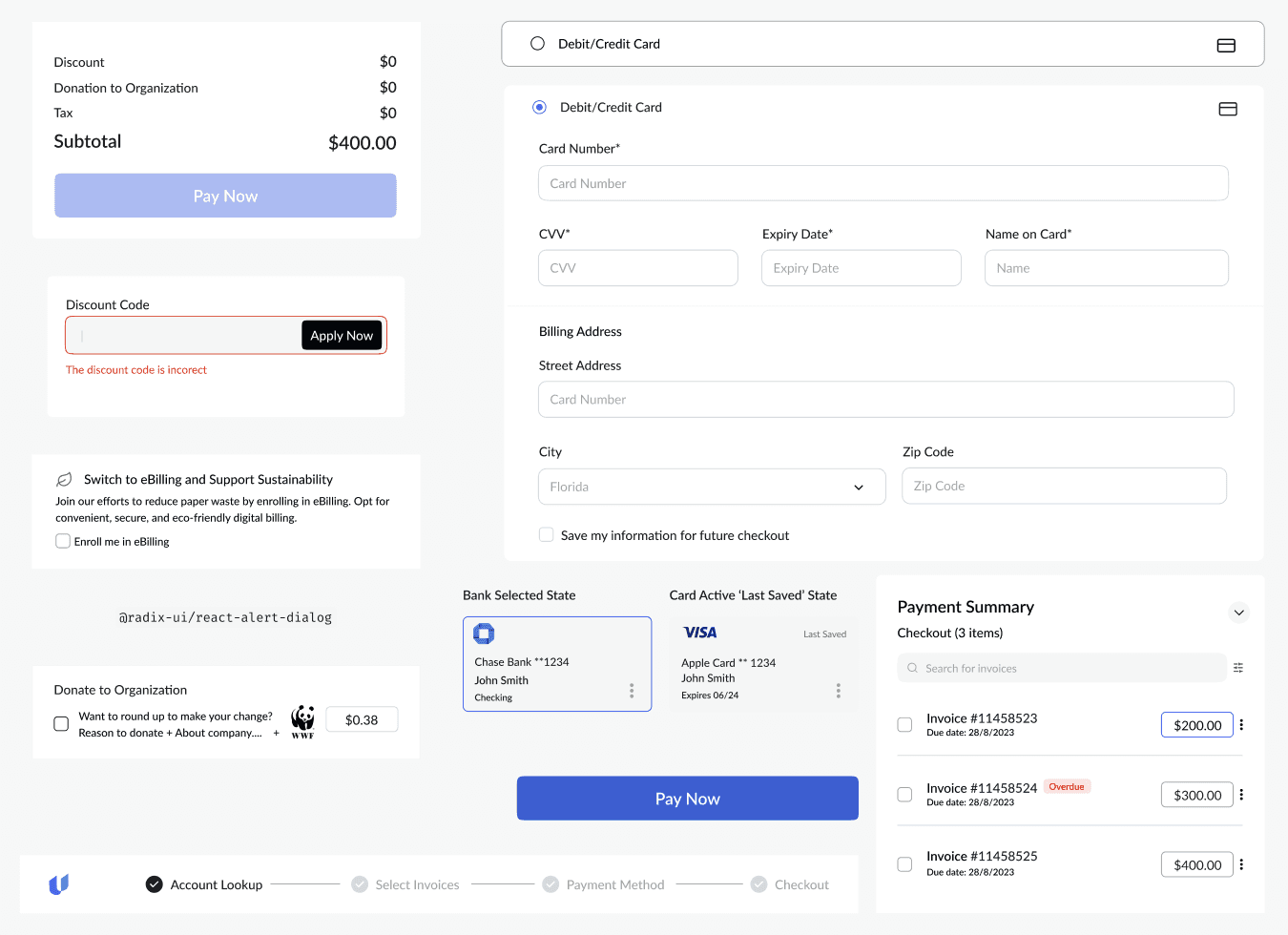
Our product users were finance and ops teams handling high-volume payments under pressure.
I prioritized clarity: larger, more legible components to reduce risk in critical moments.
I ran weekly design system reviews with engineers and stakeholders: sharing decisions, gathering feedback, and iterating so the system stayed grounded in what could actually be built.
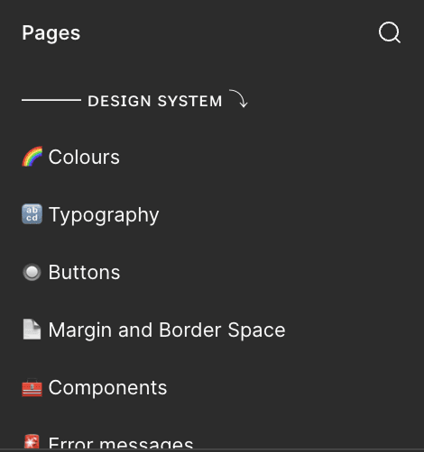
The finalized design
The result of this work led to a complete overhaul of tilli’s component documentation moving forward. I presented these updates to the broader team to gather feedback and align on how the system would scale across products.
01 — dark mode
Both modes, one system.
🌑 ⟶ 🌘 ⟶ 🌖 ⟶ 🌕
Color tokens were built to support both light and dark mode from day one. Switching modes required no component rework just swapping the token values.
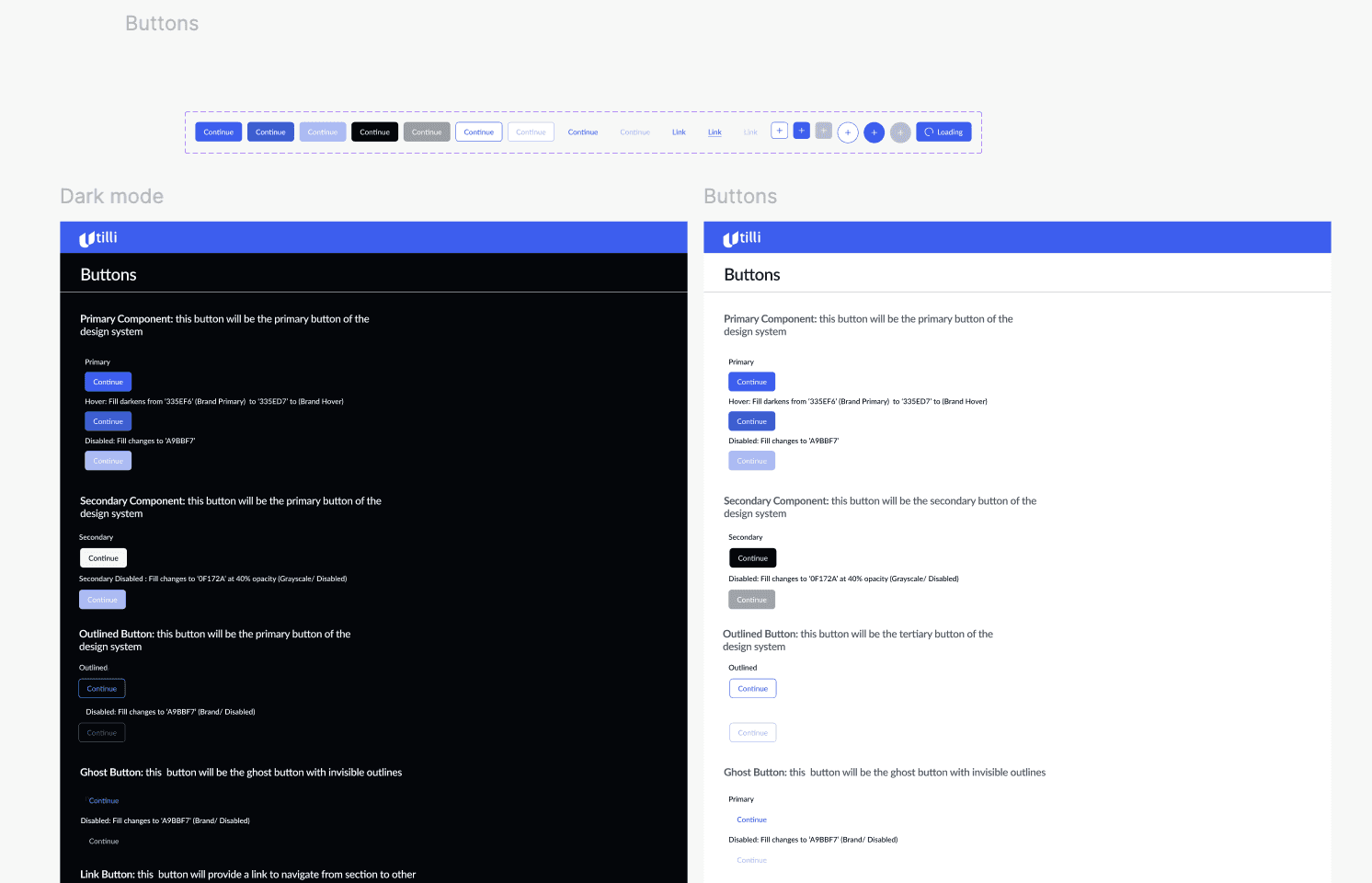
02 — scalable components
One brand reflected on every surface.
The system was built to outlast tilliX. Tokens, type scale, and components are structured so any future tilli product can inherit the foundation without starting over.
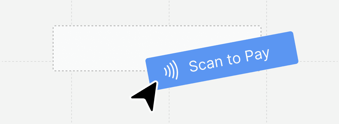
Components were composable building blocks & engineers source of truth. Quick Pay and the post-login dashboard are entirely different experiences - assembled from the same parts.
03 — accessibility
Every interactive state designed and documented.
Buttons, form inputs, cards, and data display are built with every state documented, including error, focus, and disabled.
04 — seamless integration
One update propagates across every file.
When a component in the library gets updated, every instance across every file updates with it. Engineers did not have to hunt down stale components, the system stays in sync automatically.
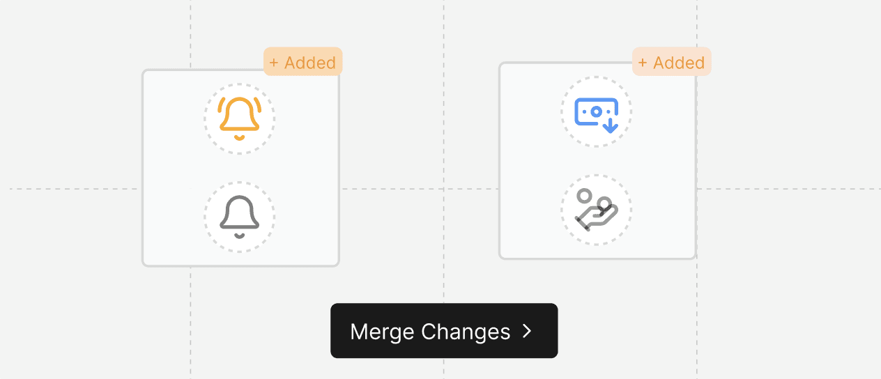
Crafting the visual experience
Once the system was established, I used it to continue building out tilliX — applying the same components and patterns across new features and flows.
Click here to see my work.