Architecting a scalable B2B payment dashboard from 0 to 1
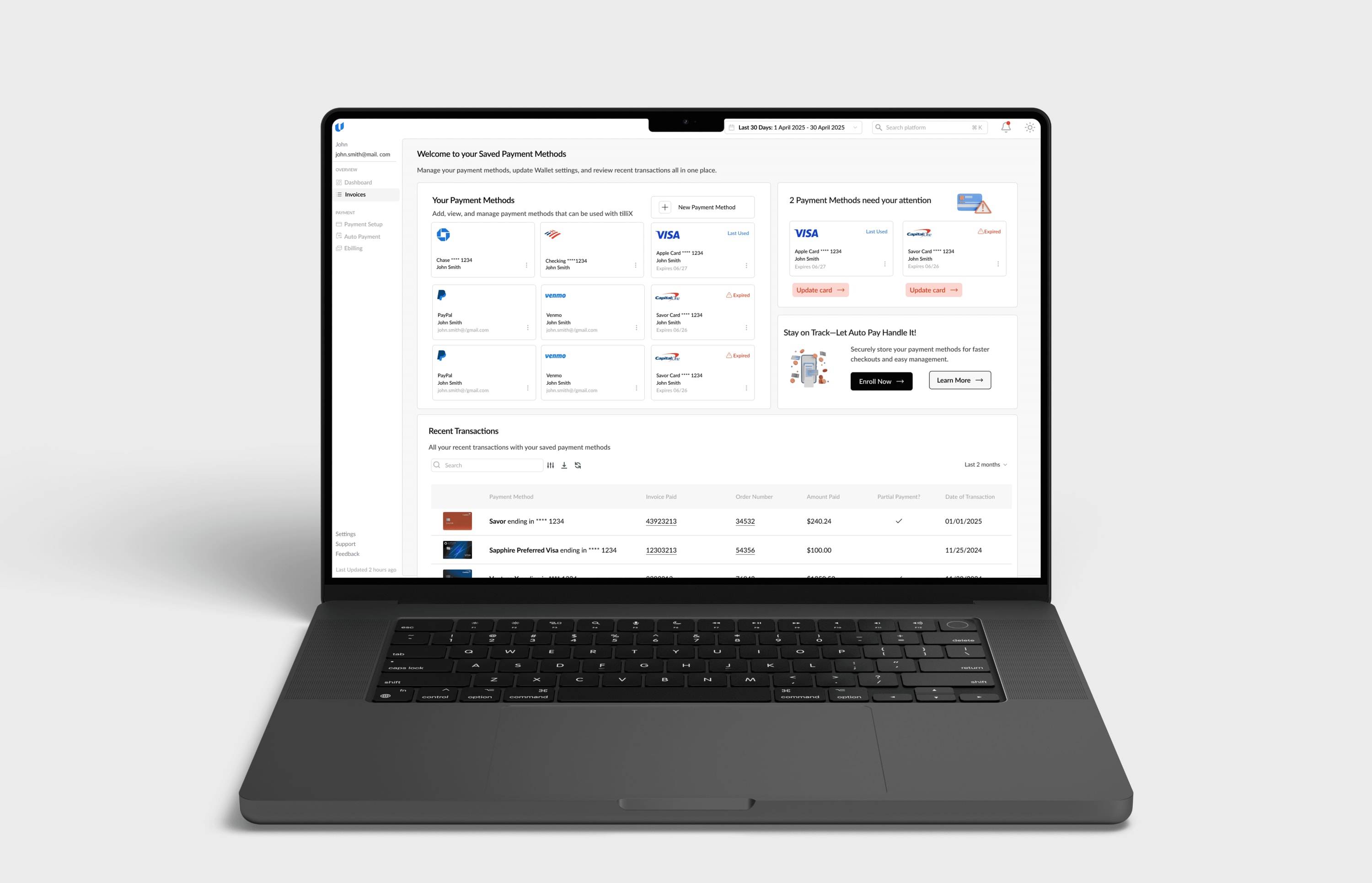
I designed the Quick Pay and post-login dashboard for tilli Software to support the full invoice lifecycle, architecting the system’s IA and workflows to enable secure transactions and ongoing financial oversight for enterprise teams.
- role
- Product Designer
- timeline
- Sept 2024 - Feb 2025
- tools
- Figma, Linear, FigJam, Datadog
The problem
How do you design one payment system for two radically different user modes?
Mode 1 — Urgency
Pay a bill in under 60 seconds.
Mode 2 — Oversight
Track, reconcile, and manage invoices over time.
No IA, workflows, or dashboard foundation existed — the challenge was defining a minimum viable system for speed, visibility, and scale.
Research
I mapped Quick Pay and post-login flows end-to-end. I reviewed support logs and spoke with client teams.
Key insights
Visual language sets expectations early
A modern system UI was critical to signal momentum and credibility.
Momentum had to be designed
Users hesitated to trust on-screen confirmations.
Users needed direction after login
The dashboard had to clearly surface what matters most, not everything at once.
Refined problem statement
The challenge was architectural: design a scalable, secure dashboard that balances transactional speed with persistent financial oversight — without compromising clarity.
Restructuring for mobile
I restructured the dashboard with a mobile-first mindset, prioritizing core actions like invoice review and payment approvals.
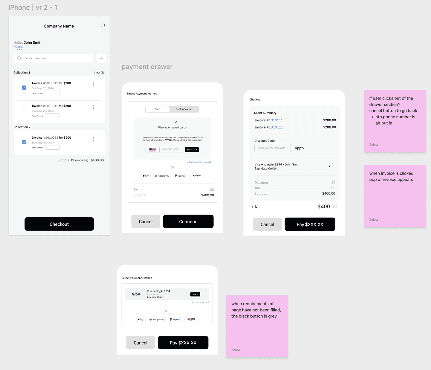
Dense tables were converted into scannable card views, and navigation was simplified to reduce friction on smaller screens.
The result was a responsive system that preserved clarity without sacrificing functionality.
Quick Pay solution
I reduced context switching during payment confirmation by keeping invoice data, verification state, payment method, and totals visible in a single interface.
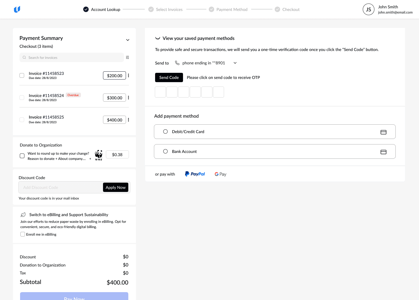
Single-screen payment flow
Invoices, totals, verification, OTP verification and payment stay in one view to prevent hesitation and loss of context.
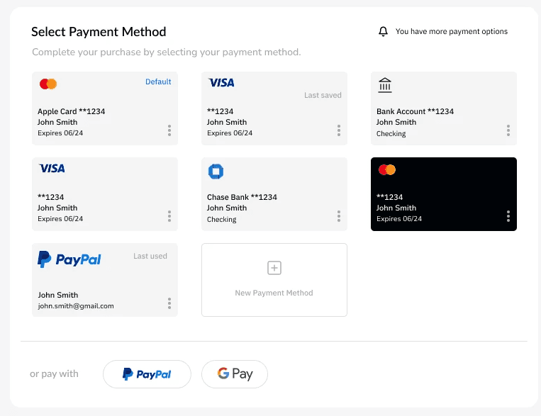
Clear payment choice
Payment methods are shown as scannable cards so users can choose quickly and confidently.
Post-login dashboard solution
I designed to surface what matters now instead of everything at once.
Invoices, totals, due dates, and status are prioritized through hierarchy so users can act immediately without scanning.
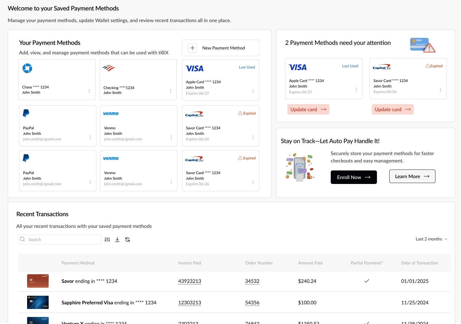
Wallet
I introduced a dedicated wallet space so users can resolve payment issues ahead of checkout.
Separating payment management from payment moments reduces friction.
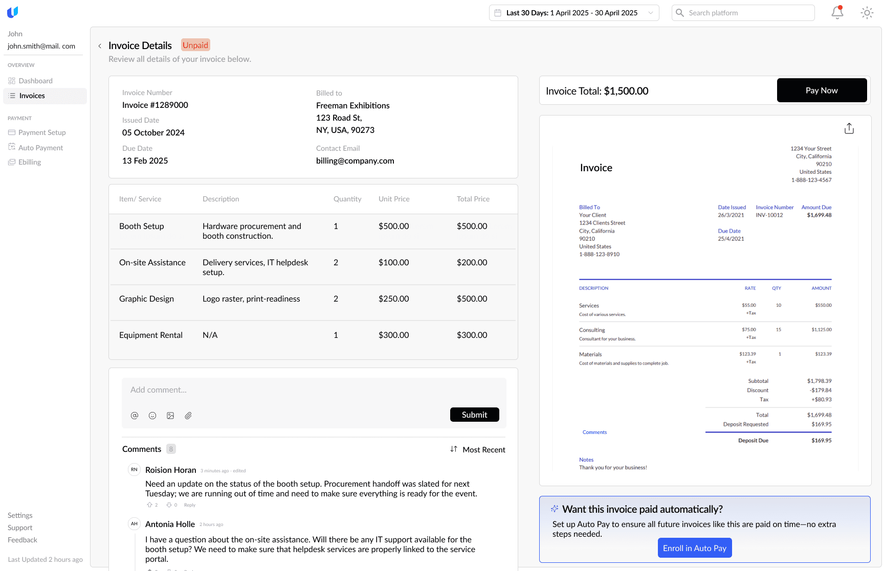
Expanded invoice view
Invoice details, payment, and conversation live in one view to keep decisions focused.
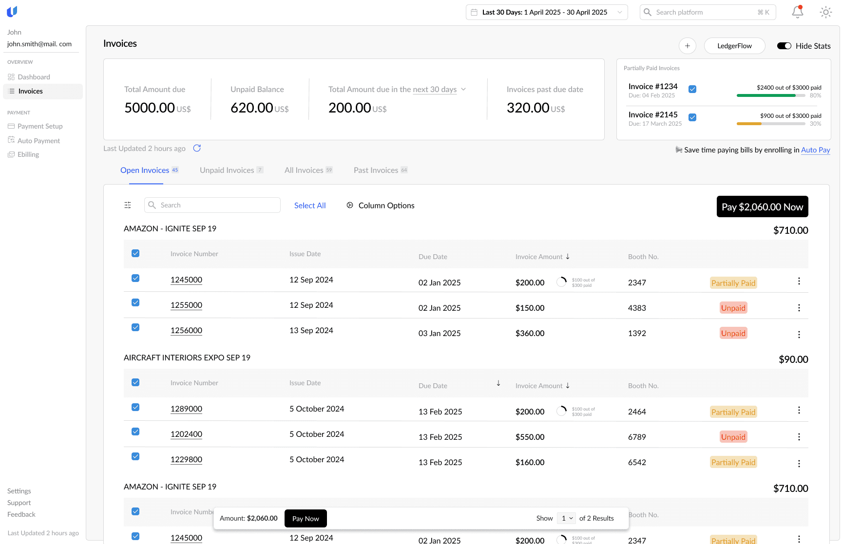
Clear status at a glance
Totals, due dates, and payment status are prioritized so users know what needs action immediately.
What I learned
Quick Pay and post-login needed different mindsets
One of the hardest parts was clearly separating Quick Pay and post-login. I had to be intentional about why they felt different; Quick Pay needed speed and reassurance, while post-login needed control, without making the product feel inconsistent.
Considering the security aspect
Security was also a real challenge. Designing a space where users can see multiple payment methods at once meant there had to be trust, since it's all their accounts. We chose OTP as the best balance between usability and protection, but it pushed me to think more critically about how security is communicated in the UI, especially when real money is involved.