Zehra Jaffrey

case study · 2025

Reframing a multi-product platform

As the solo product designer, I redesigned tilli’s company website, focusing on restructuring the information architecture to clarify product positioning, and deploying with an AI-assisted pipeline.

role
Product Designer
skills
Wireframes, Web UX design, Design systems
tools
Figma, Cursor, Vercel, GitHub, Linear, FigJam, Webflow.
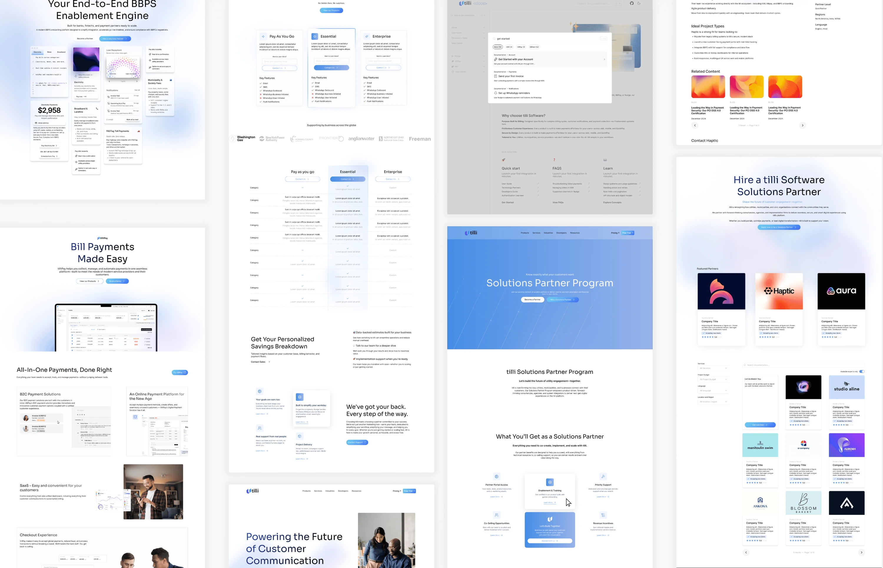
A collage of pages from the redesigned tilli.pro website: pricing, bill payments, an end-to-end BBPS enablement engine, a solutions partner program, and industry pages.

The problem

How might we turn a fragmented website into a clear, conversion-driven story, powered by AI-assisted delivery?

Prepping for AI build

The tools used at each stage of the AI build: Research and notes (ChatGPT, Jira), Brainstorm (Figma, Vercel), Prototype (Claude, Cursor) and Deployment (GitHub, Vercel).

In parallel with research, I planned an AI-assisted build workflow to enable rapid iteration without a traditional handoff.
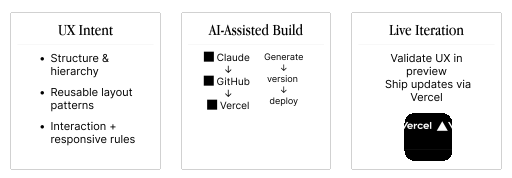
Diagram of the AI-assisted workflow in three parts. UX Intent: structure and hierarchy, reusable layout patterns, interaction and responsive rules. AI-Assisted Build: Claude generates, GitHub versions, Vercel deploys. Live Iteration: validate UX in preview, ship updates via Vercel.

Customer interviews and website audit

I interviewed our clients to understand how they evaluated our products.

I used AI to help draft the interview guide. The questions that mattered, and what I took from the answers, were mine.
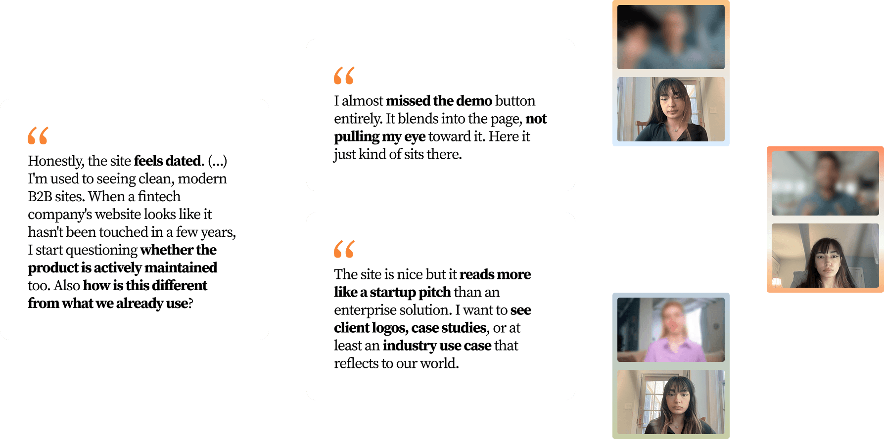
Three quotes from the interviews, beside video-call thumbnails of the interviewees. “Honestly, the site feels dated. (...) I'm used to seeing clean, modern B2B sites. When a fintech company's website looks like it hasn't been touched in a few years, I start questioning whether the product is actively maintained too. Also how is this different from what we already use?” “I almost missed the demo button entirely. It blends into the page, not pulling my eye toward it. Here it just kind of sits there.” “The site is nice but it reads more like a startup pitch than an enterprise solution. I want to see client logos, case studies, or at least an industry use case that reflects to our world.”
Interview quotes from clients.

I also audited the existing site’s flow, navigation, and messaging to identify gaps and friction.
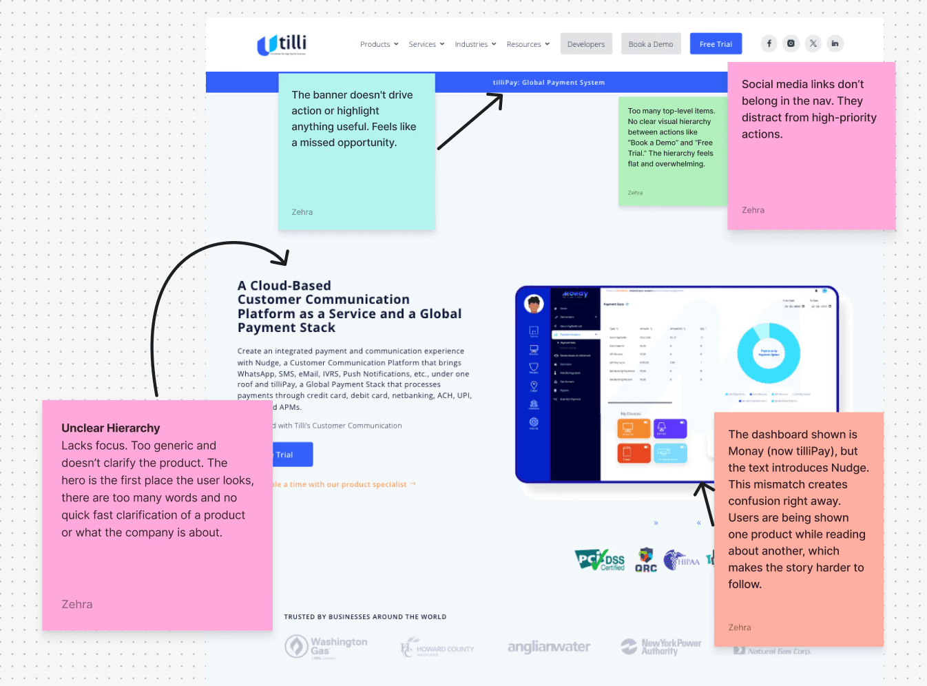
A screenshot of the existing tilli site with sticky-note annotations. “The banner doesn't drive action or highlight anything useful. Feels like a missed opportunity.” “Too many top-level items. No clear visual hierarchy between actions like Book a Demo and Free Trial. The hierarchy feels flat and overwhelming.” “Social media links don't belong in the nav. They distract from high-priority actions.” “Unclear Hierarchy: Lacks focus. Too generic and doesn't clarify the product. The hero is the first place the user looks, there are too many words and no quick fast clarification of a product or what the company is about.” “The dashboard shown is Monay (now tilliPay), but the text introduces Nudge. This mismatch creates confusion right away. Users are being shown one product while reading about another, which makes the story harder to follow.”
The existing site, annotated for flow, hierarchy and messaging gaps.

After auditing site flow, navigation, and messaging, I identified three friction points:

  1. 1

    unclear product differentiation

    (It’s hard to tell what each product does or who it’s for.)

    = drop-off.

  2. 2

    flat visual hierarchy

    (Everything feels the same… nothing guides my attention or attracts me.)

    = can't build trust.

  3. 3

    generic messaging

    (I can’t tell what makes tilli unique, and there’s too much to read.)

The interviews echoed these points: interviewees said the site felt dated, asked how it differed from what they already use, almost missed the demo button, and wanted client logos, case studies, or an industry use case.

Market research

So I studied modern B2B SaaS sites to see how they explain complex products clearly and quickly.

I used AI to compare competitors’ onboarding, pricing, and features. It is great at pulling that information together, so I double-checked the sources it drew from, verified the facts myself, and decided what mattered for our users.

companies studied:

  • Stripe

    → visual clarity and brand maturity

  • Ramp

    → storytelling and interaction design

  • Plaid

    → product depth and trust-building

Market positioning of enterprise fintech websites
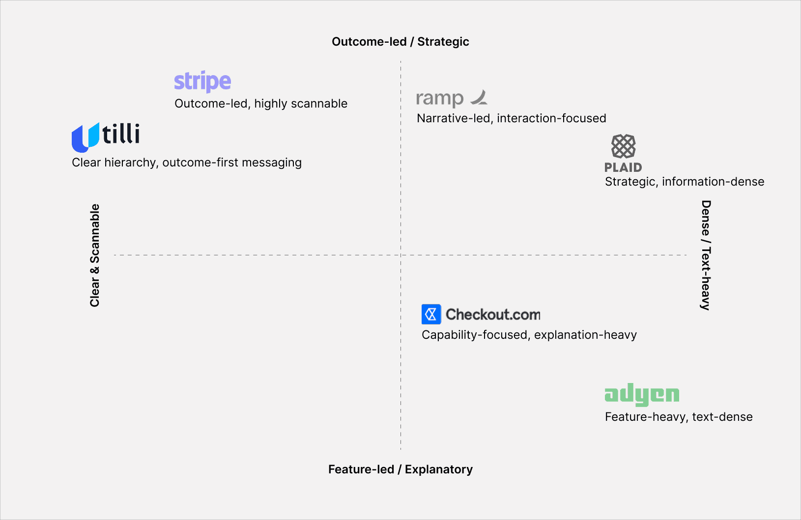
A positioning map of enterprise fintech websites. The vertical axis runs from outcome-led and strategic (top) to feature-led and explanatory (bottom); the horizontal axis from clear and scannable (left) to dense and text-heavy (right). Stripe: outcome-led, highly scannable. tilli: clear hierarchy, outcome-first messaging. Ramp: narrative-led, interaction-focused. Plaid: strategic, information-dense. Checkout.com: capability-focused, explanation-heavy. Adyen: feature-heavy, text-dense.

Mood board

Defining tilli.pro’s visual identity was a genuinely fun process. I leaned into a cool, gradient-driven language that feels almost electric, crisp, fluid, and built with a sense of quiet velocity.
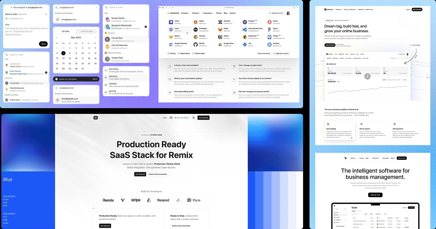
A mood board of enterprise software website screens with cool blue gradients, including a Production Ready SaaS Stack for Remix page and a business management software page.

Building with AI

The tilli website was built using an AI-assisted workflow that translated UX intent directly into production.
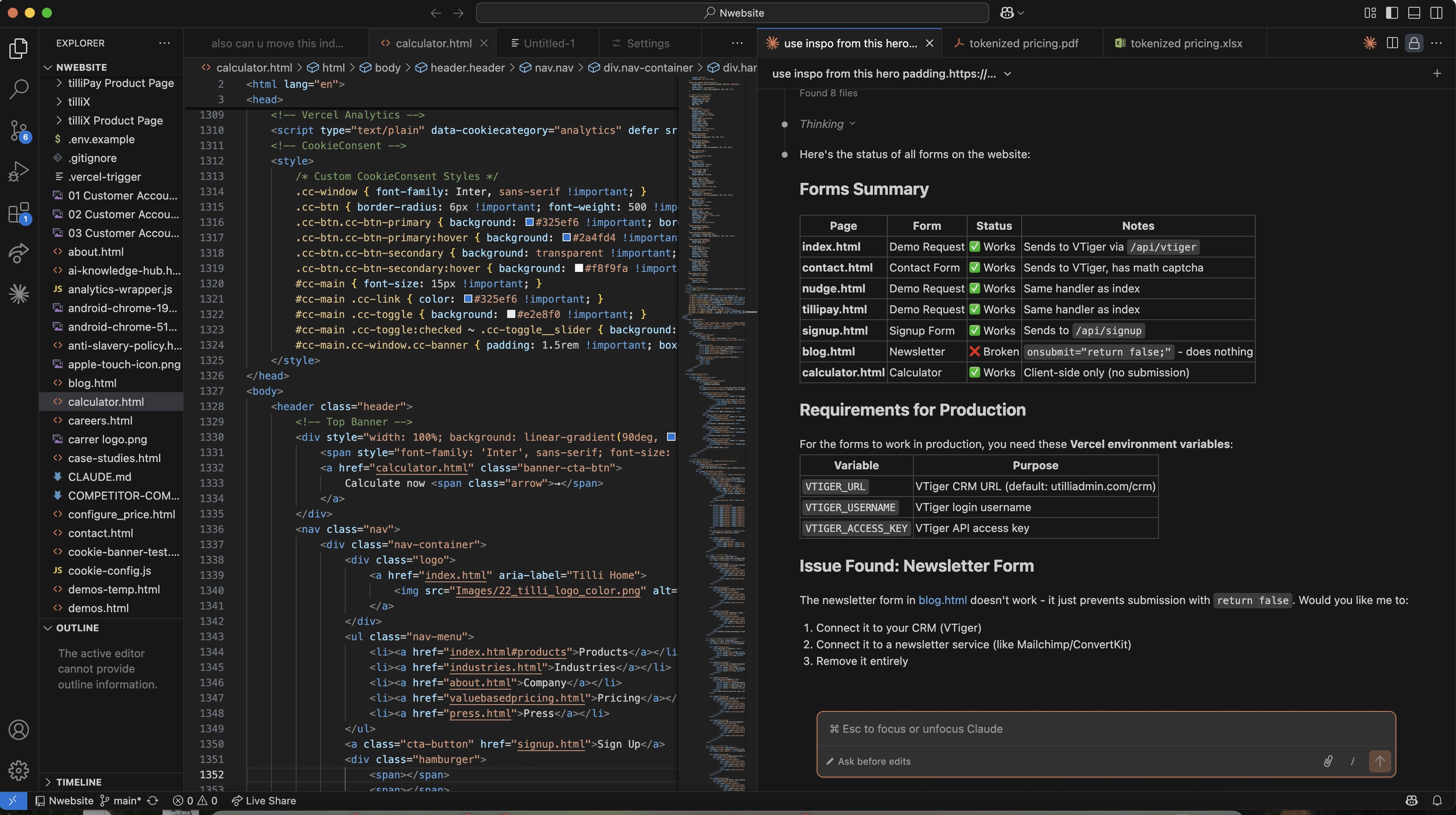
A code editor showing the tilli website's HTML next to an AI assistant panel that summarises forms (page, form, status and notes) and lists requirements for production, including an issue found with the newsletter form.

Deploying through Vercel, I was able to create a design to production pipeline for our company website. I used an AI-assisted workflow to move from design into implementation and deployment.
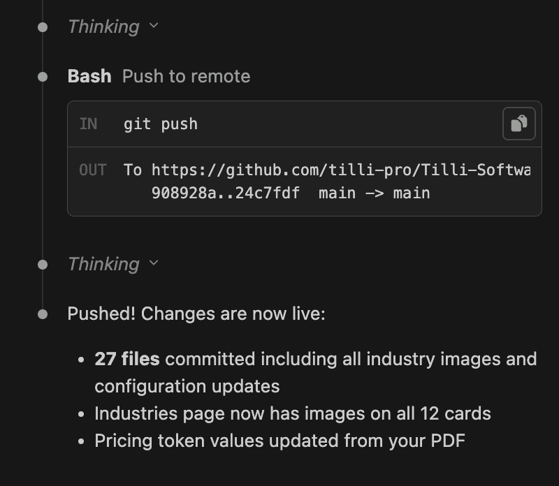
An AI assistant's terminal output: a git push to the tilli-pro/Tilli-Software repository on main, then “Pushed! Changes are now live:” with the notes that 27 files were committed including all industry images and configuration updates, the industries page now has images on all 12 cards, and pricing token values were updated from the PDF.

Information architecture and product positioning

One clear story: what tilli does, who it serves, and why it matters.

Two paths

Option 1

Improve the existing pages with clearer copy and updated visuals.

vs

Option 2

Rebuild the site around a single, clear narrative with reusable sections.

Chose Option 2: solving both user confusion and long-term scale.

Key features

  1. 1

    Platform-first framing → Every page defines the value clearly.

  2. 2

    Outcome-led navigation → User goals > internal product names.

  3. 3

    Modular sections → Reusable sections for scale + consistency.
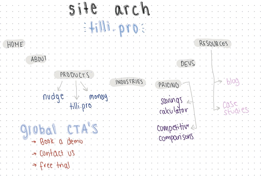
A hand-drawn site architecture for tilli.pro: Home, About, Products (nudge, money, tilli.pro), Industries, Pricing (savings calculator, competitive comparisons), Devs and Resources (blog, case studies), with global CTAs: Book a demo, Contact us, Free trial.
Hand-drawn site architecture for tilli.pro.
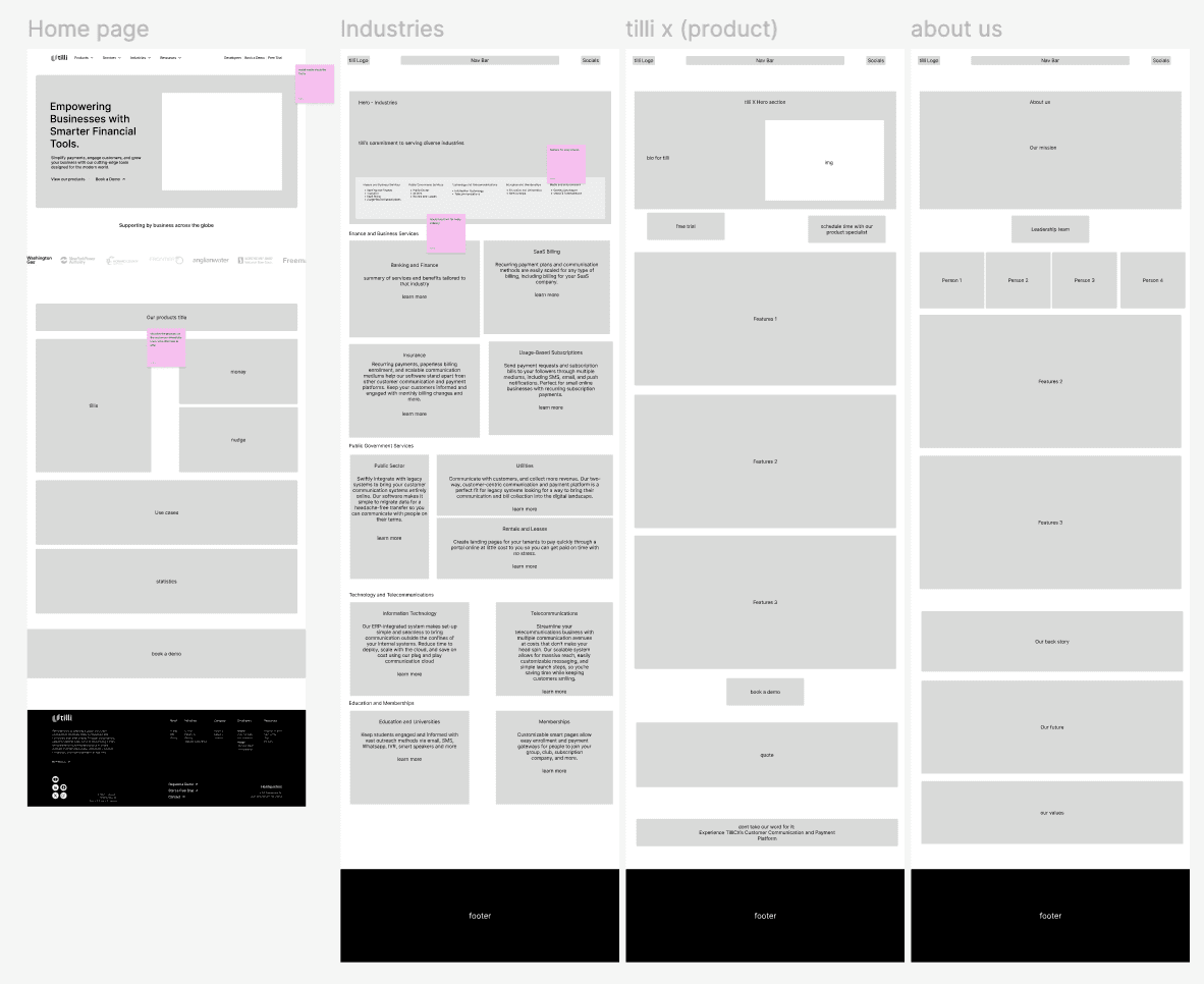
Grey wireframes of four page types, side by side: Home page, Industries, tilli x (product) and About us, each ending in a black footer.
Wireframes for the home, industries, product and about pages.

I presented design proposals to software engineers and our CEO for feedback.

Solution

#1: Show measurable impact to their enterprise before sales.

Enterprise buyers needed proof.

So I designed an interactive savings calculator, inspired by SaaS estimators, so users could self-validate ROI.
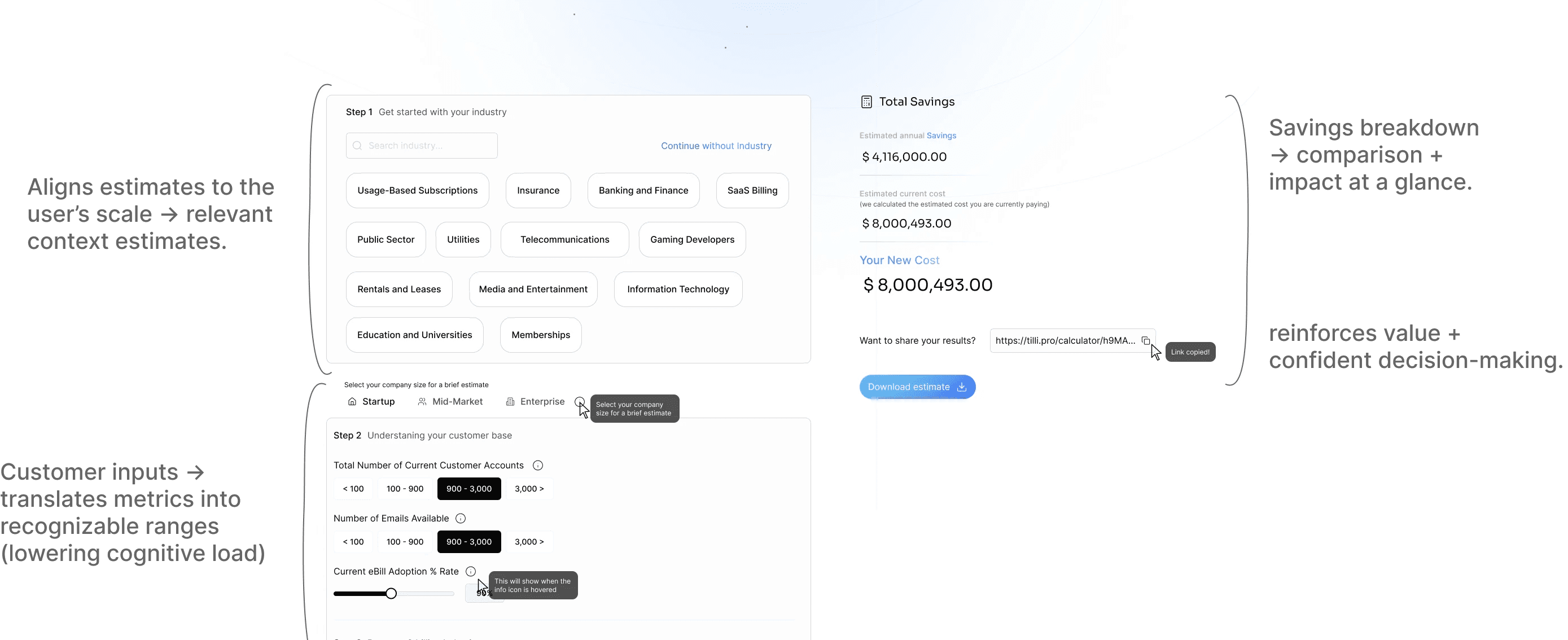
The savings calculator with annotations. Step 1, get started with your industry: industry chips such as Usage-Based Subscriptions, Insurance, Banking and Finance, SaaS Billing, Public Sector and Utilities. Step 2, understanding your customer base: company size (Startup, Mid-Market, Enterprise), number of customer accounts, emails available and eBill adoption rate. A Total Savings panel shows estimated annual savings, estimated current cost, your new cost, a share link and a Download estimate button. Notes: “Aligns estimates to the user’s scale → relevant context estimates.” “Customer inputs → translates metrics into recognizable ranges (lowering cognitive load)” “Savings breakdown → comparison + impact at a glance.” “reinforces value + confident decision-making.”
The interactive savings calculator, annotated.

#2 The site overlooked developers evaluating integrations and APIs.

I designed structured, utility-first developer pages to speed up comprehension and decision-making.

Structured, utility-driven dev pages.

  • → Clear API framing
  • → Faster comprehension

Helping developers quickly answer: can this work for us?

#3 Messaging didn’t build trust.

Generic copy obscured product value, so I rewrote it to clearly define purpose and relevance.

#4 Users couldn’t form a clear mental model of the platform.

I restructured the IA around platform logic to clarify relationships and reduce cognitive load.

Final designs

The redesigned tilli.pro website presents tilli as a cohesive, enterprise-ready platform rather than a collection of disconnected products.

Each product has its own structured page, with clear sections that help users understand purpose, audience, and value based on their intent.
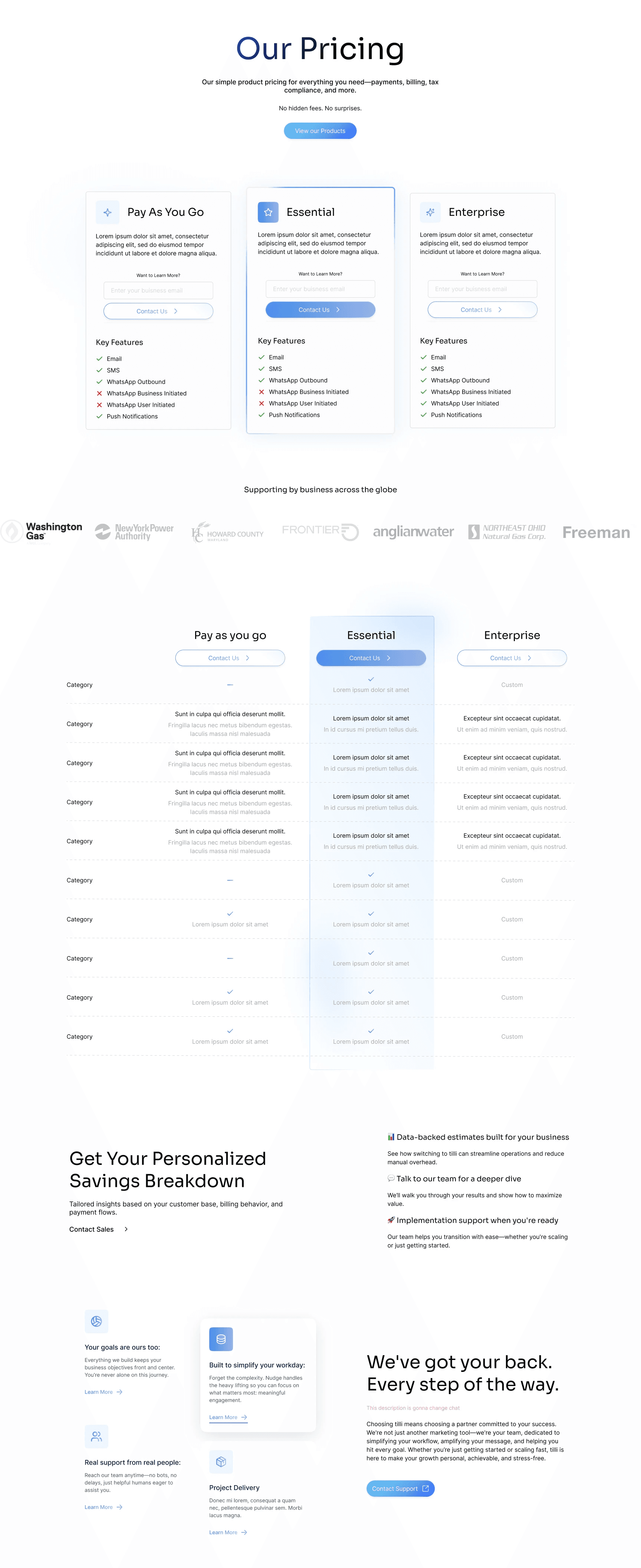
The full pricing page: Our Pricing, three plans (Pay As You Go, Essential, Enterprise) with key features, supporting business logos, a plan comparison table and a personalised savings breakdown.
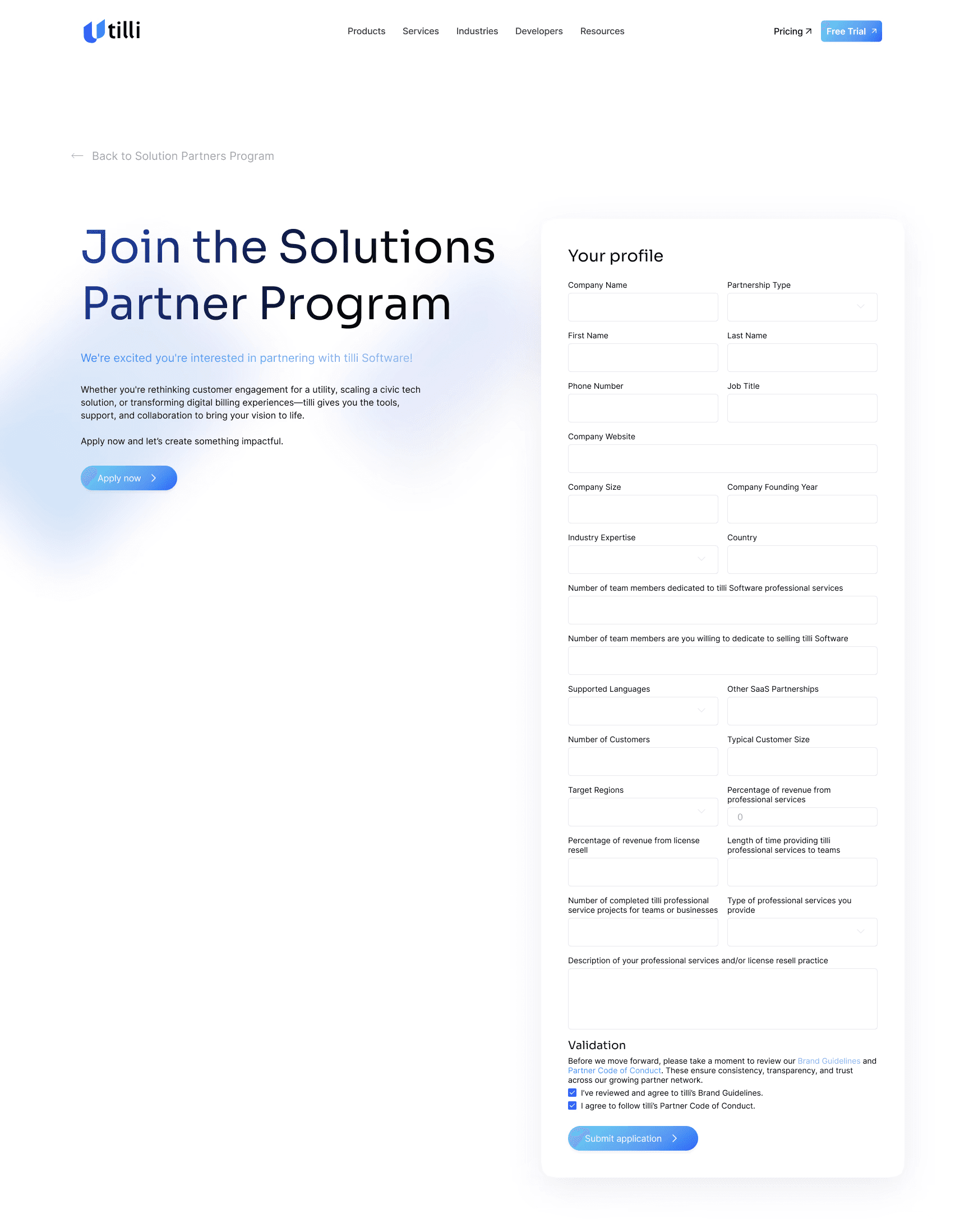
The Join the Solutions Partner Program page, with a long partner profile form.
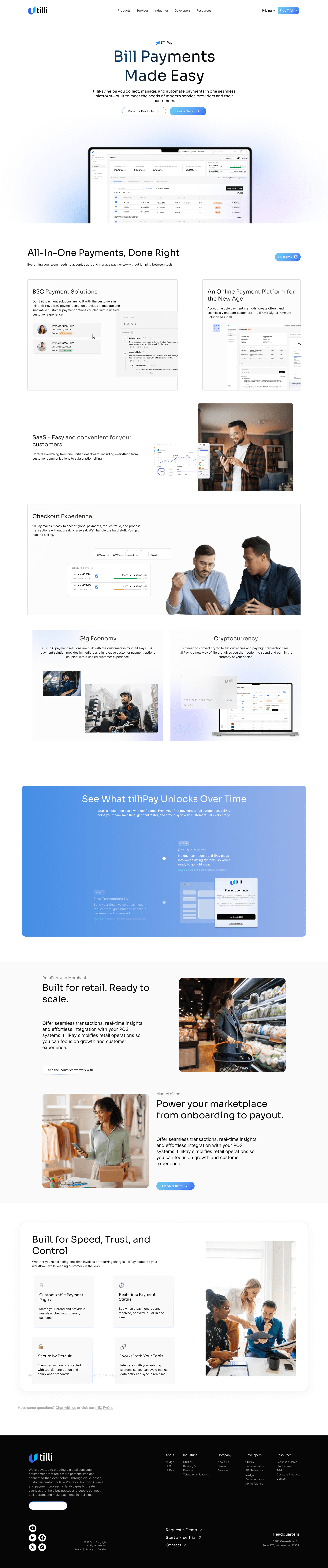
The full Bill Payments Made Easy product page: an introduction with a laptop dashboard, All-In-One Payments Done Right, checkout experience, gig economy and cryptocurrency sections, See What tilliPay Unlocks Over Time, retail and marketplace sections, Built for Speed, Trust, and Control, and a black footer.
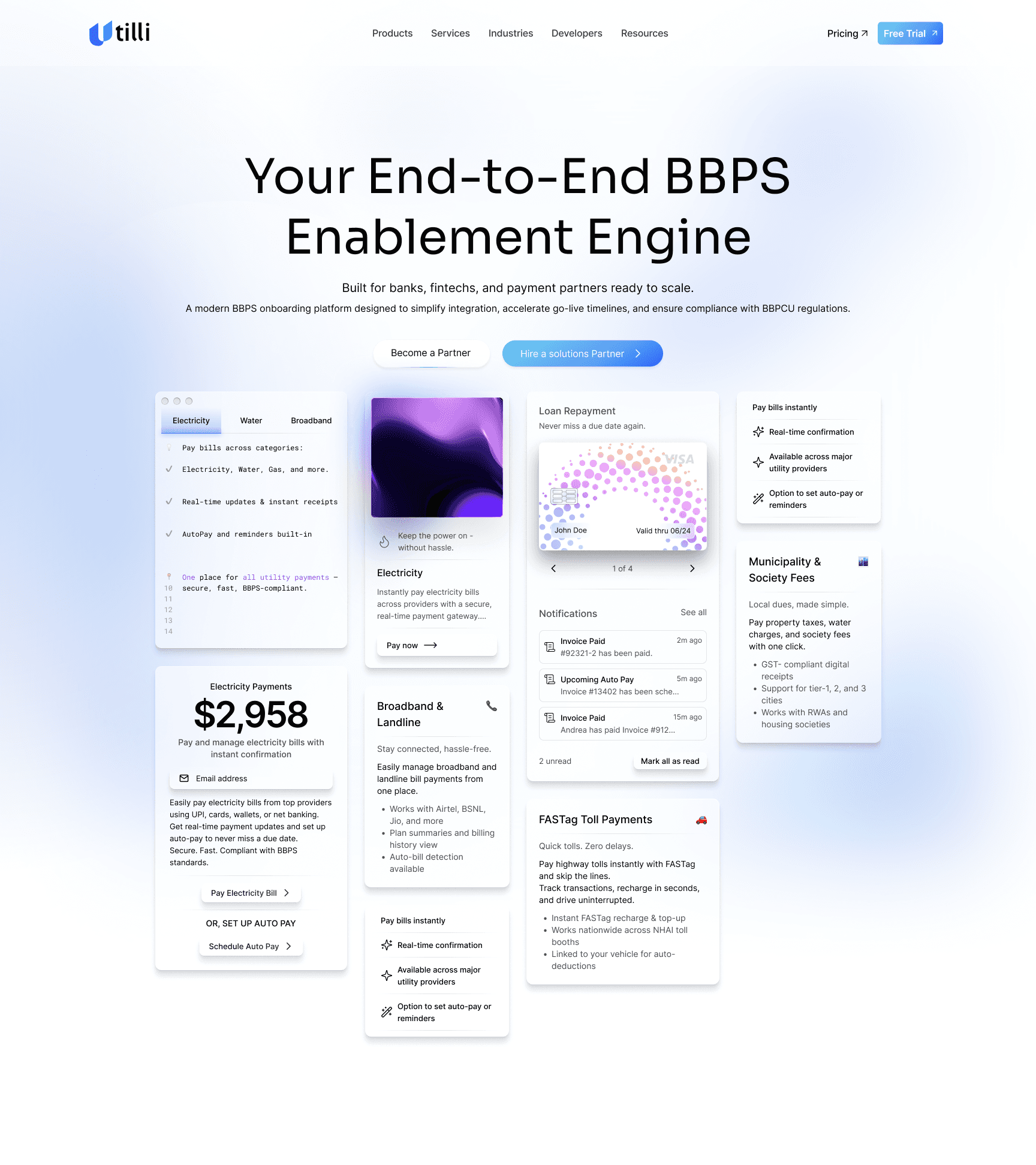
The Your End-to-End BBPS Enablement Engine page, with product cards showing bill payments, notifications and settings.
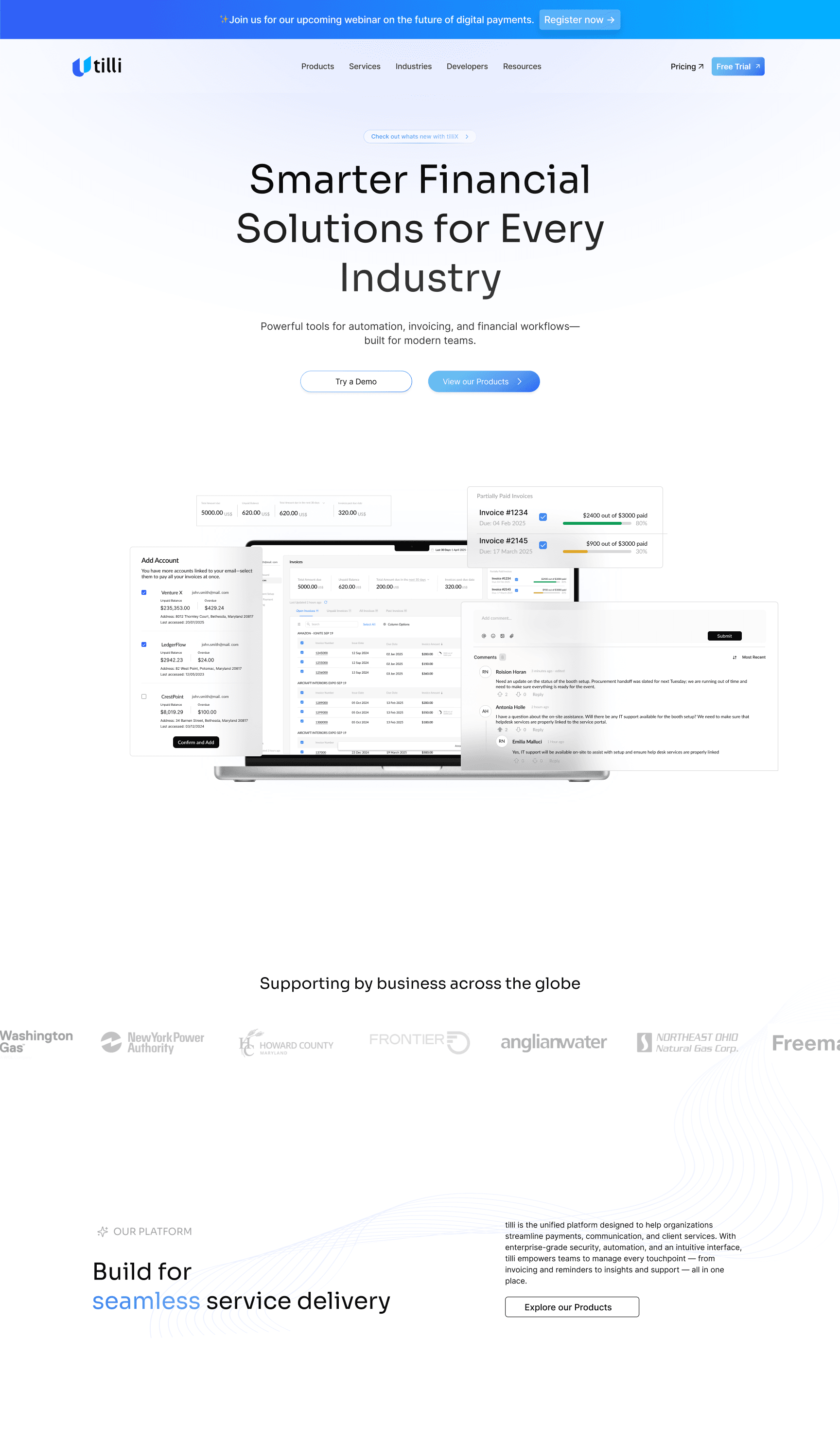
The home page: a banner, then Smarter Financial Solutions for Every Industry with a laptop dashboard, supporting business logos, and Build for seamless service delivery.
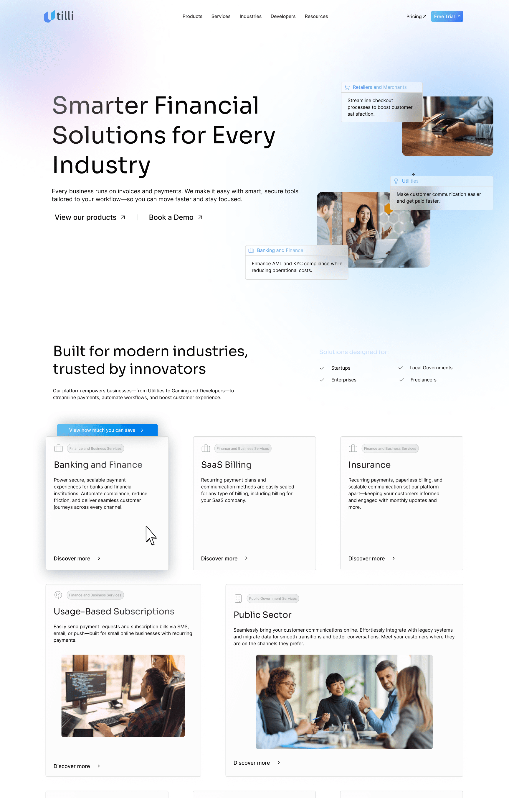
The industries page: Smarter Financial Solutions for Every Industry, then Built for modern industries, trusted by innovators, with cards for Banking and Finance, SaaS Billing, Insurance, Usage-Based Subscriptions and Public Sector.

What I learned

Designing this as a solo designer had me constantly switching my focus between strategy, structure, visuals, and execution. I had a lot of mental blocks when deciding what not to design and what to focus on, and often I thought that if I had another designer, the answer might be clearer.

Instead, a software engineer on my team told me to use those mental blocks to slow down and pressure-test decisions: Is this clear? Is this necessary? Does this help someone move forward?

Over time, I learned that clarity doesn’t come from adding more, but from removing friction and committing to a direction.

This project helped me understand the value of thinking in systems, not just the visual screens. Once the foundation and structure of what I wanted to implement visually was right, decisions felt lighter, and the design became easier to scale and explain.