Overview
What if Beli made deciding where to eat easier?
What if Beli… had a ‘merge’ mode for deciding with friends? (๑ᵔ⤙ᵔ๑)
Also an attempt to adjust my design workflow with AI !
- role
- UX Designer (personal project)
- timeline
- April 2026
- tools
- Figma, Loveable, Chatgpt, Claude
The Problem
Picking a place with friends is weirdly hard even when you both already have options saved.
and then you end up getting Chipotle… wasting the potential of trying a new place in the city.
Research
Most food apps act as if:
“The more options you show, the better the choice.”
But in group decisions:
- More options = more negotiation, not more clarity.
- People default to the loudest preference instead of the best one.
Not optimizing for choice … but for agreement.
Why this matters
I started by prompting ChatGPT and Claude to help me articulate why this felt like a real problem worth solving -> and kept coming back to the same tension: it's not a discovery problem, it's an agreement problem.
Flow Challenge
Option 1
**Discovery First** • Let users browse restaurants • Then help them narrow together
Option 2
**Alignment First** • Collect preferences up front • Then surface options that match both
I used Claude to pressure-test both directions, prompting it to argue for Discovery First so I could see the strongest case against my instinct. Alignment First still won.
The Journey
Remember the number of minutes wasted picking a movie for movie night.
I have seen that deciding where to eat is as difficult: different food preferences, dietary restrictions, etc.
Without a full research team, I used Claude to simulate the process: generating personas, mapping pain points, and walking through journey stages.
The biggest pattern it surfaced: the frustration doesn't start at the restaurant. It starts at “so where do you want to go?”
That reframed everything.
AI as Part of My Process
I used ChatGPT and Claude to pressure-test my thinking, prompting them to argue against my decisions before I committed to them.
I also built a clickable prototype in Lovable early on, which made friction in the flow obvious in a way static frames don't.
Using AI earlier meant fewer surprises later. ₊˚ ⋅
Final Designs
The final flow focuses on getting to agreement quickly.
Users start a Let’s Eat session inside Beli, invite a friend, and immediately see overlapping saved spots.
Design system reference: Beli's Design System by Nisheta Gupta, Shivani Mehta, Hugo He and Sandra Ye
Reflections
Hope you enjoyed this quick case study! ₊˚ ⋅ 𓐐𓎩 ‧₊˚ ⋅
I love Beli’s 🍽️₊˚ simplicity and how intentional it is about keeping user journeys short.
Using AI throughout changed my process more than I expected. It replaced the whiteboard conversations I'd usually have with a team… and pushed me to question assumptions earlier.
Designing for alignment instead of discovery changed how I think about group decision flows. (๑ᵔ⤙ᵔ๑)
My beli heheh: beliapp.co/app/souupy
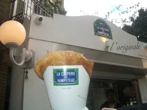
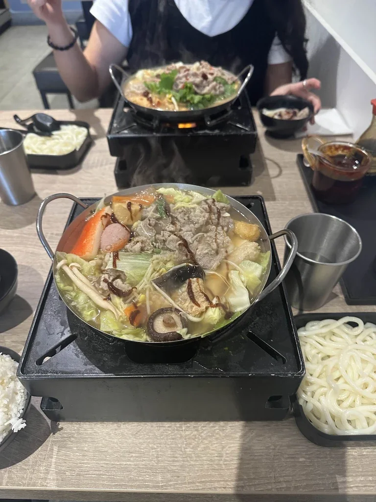
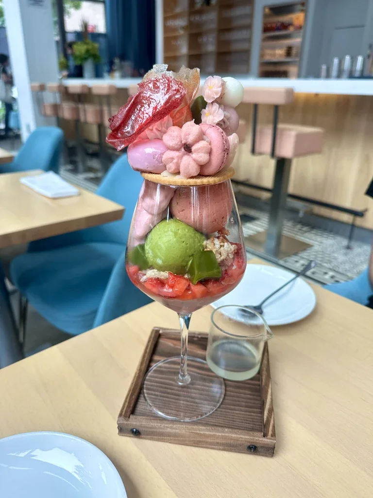
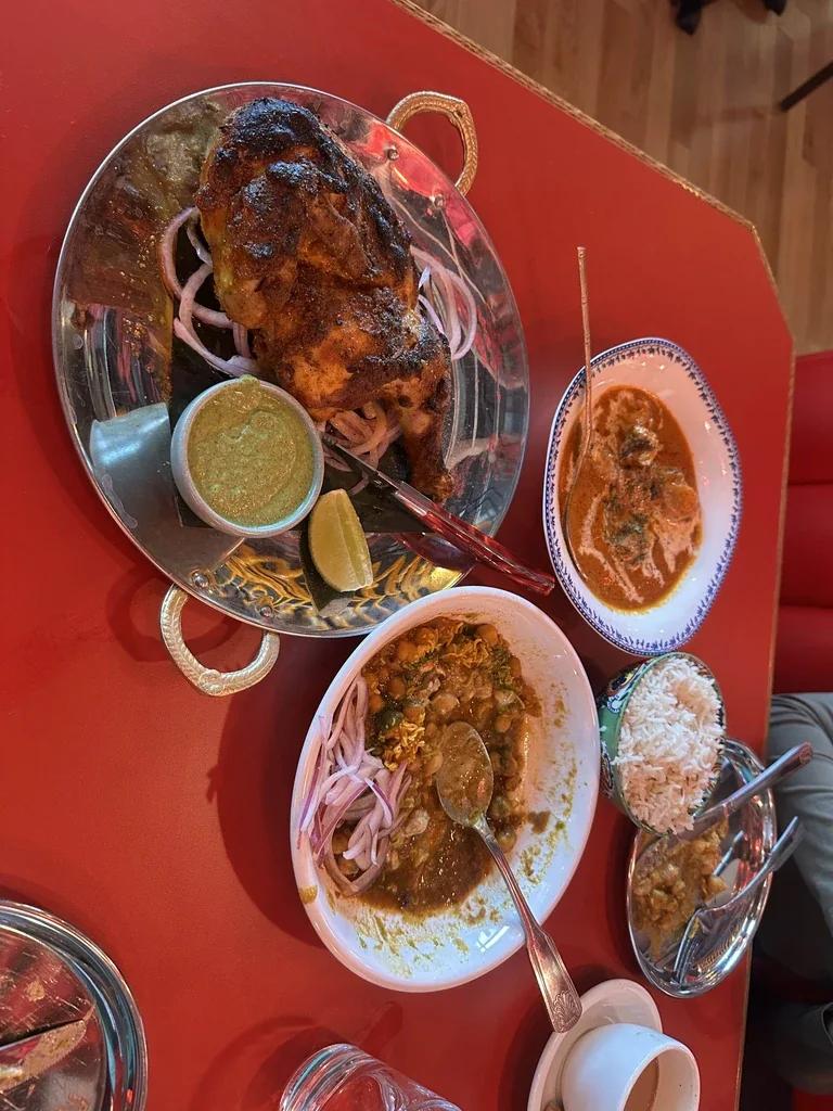
My ultimate favourite foods from my travels in London, Toronto, New York and DC!