Paramount's Vantage
[1]
Redesigning Paramount’s ad sales planning platform around planner mental models while building the production-grounded component library to scale it.
Role
UX / Product Designer
Team
Ad Sales Technology
Tools
Figma, Claude Code, Vercel, GitHub, AI-Assisted Pipelines

The Problem
[2]
Vantage is Paramount’s internal enterprise platform used to build ad campaigns across linear TV and digital streaming.
Two audiences merged in one workflow
Linear TV and digital buying were forced into one flow despite different data and rules, creating ambiguity, irrelevant fields, and planner friction.
The System Debt: No UI Source of Truth
Components were scattered across production, legacy code, and outdated Figma files, creating inconsistent UI and compounding technical and design debt.
System Architecture & Sequencing
[2]
Fix the underlying mental model before touching the screens.
When we retired the convergent path, I structured the redesign sequentially to guarantee global consistency across every user touchpoint:
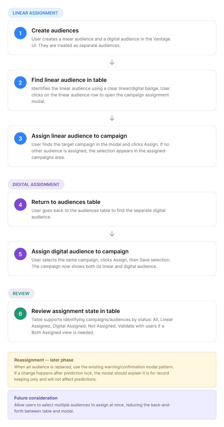
Auditing Reality Over Documentation
Live Production > Bootstrap View > Legacy Figma > Community Kits
I used the current Vantage to uncover gaps and edge cases missed in documentation and avoid building disconnected components.
From Audit to Production: Building the System Behind Vantage
[3]
I audited Vantage's UI, co-built its component library, designed a complex multi-select, and took it through engineering sign-off.
1. Audit
→ Found what production actually looked like
Ranked sources: live UI → Bootstrap View → Figma → community kit
Audited 40+ components and surfaced gaps in consistency and accessibility
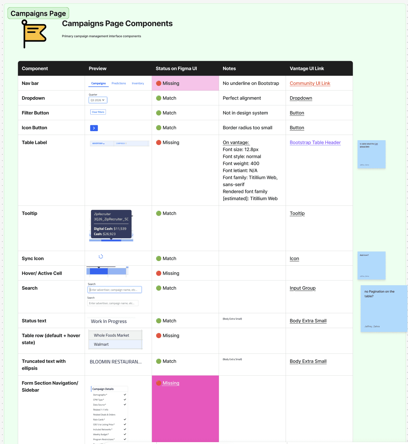
2. Core Components
→ Standardized the foundation
Co-built the Figma component library with my design lead
Built tables cell by cell from dev specs so new layouts are assembly, not redesign
Mapped tokens 1:1 to PAM/shadcn for future migration

3. designing the multi select Component
Users needed to select up to 50 states and regional markets, but the existing dropdown wasn’t built for high-volume selection, leading to clipped text, inconsistent sizing, and unclear selection states.
I started with low-fidelity wireframes to test layout patterns for multi-item selection within high-density forms:

I explored:
Selection patterns: inline tags vs. text-based selections
Overflow: expanding inputs vs. a fixed height with a
+NcounterSearch: filtering within the dropdown vs. a separate search field
Bulk actions: select all, clear all, and individual removal
Interaction states: how selections should persist while searching and filtering
Prototyping & Engineering Review
Static frames couldn’t capture overflow, resizing, keyboard navigation, or accessibility states, so I built the component in Figma Make to test real interactions and edge cases.
I brought the prototype into a joint design + engineering review, allowing us to validate feasibility and align on implementation in a single session.
Trade Offs & Architectural Decisions
[4]
Every design decision in this platform was driven by three simple questions every sales rep needs answered:
Solving Data Quality at Entry
The Decision: Block duplicate records before they are created.
How It Works: Built real-time record checking into the initial input fields across 21 agencies and 7 holding companies.
Why It Matters: Preventing bad data at entry protected downstream revenue reporting across high stake ad deals.
Progressive Disclosure for Deep Taxonomies
The Problem: Media buying involves dozens of parameters (network restrictions, time blocks, exclusions) that usually result in massive, unreadable forms.
The Trade-Off: Instead of showing 60+ options at once, I used tag-based progressive disclosure (CBS News ✕, 5AM–9AM ✕).

Key UX Choices:
3-Step Task Chunking for setup
Inline Tags for instant visual auditing
Collapsed Tail Lists/ default views to keep the UI clean.
Predictive Feedback & Tiered Error Handling
The Problem: Media buying involves dozens of parameters (network restrictions, time blocks, exclusions) that usually result in massive, unreadable forms.
The Trade-Off: Instead of showing 60+ options at once, I used tag-based progressive disclosure (CBS News ✕, 5AM–9AM ✕).

Visual Health States: Uses segmented progress bars and semantic colors (Green/Yellow/Red) to show deliverability status instantly.
Prescriptive Fixes: Surfaces direct actions ("Choose Peak Placement", "Expand audience") when deliverability drops.
Tiered Warnings: Uses soft inline banners for minor risks and blocking modals only for critical budget/targeting conflicts.

Narrow targeting rules can accidentally starve campaign delivery, causing missed revenue targets
→
Engineered live data feedback components to catch issues early.
Inline Checkpoints over Review Pages

Traditional review pages are passive text dumps users blindly click through. I replaced them with a progressive checkpoint architecture
Ending Thoughts
[5]
In next steps I would instrument flow tracking and run A/B testing to capture task completion speeds, drop-off rates, and clear ROI metrics for executive leadership.
This project helped me learn to use live code as the ultimate alignment tool.
High-velocity prototyping bought instant credibility with operational teams. Shipping live URL prototypes eliminated endless debate over static mockups and exposed real data constraints in days rather than sprints.
Footer
[6]